|
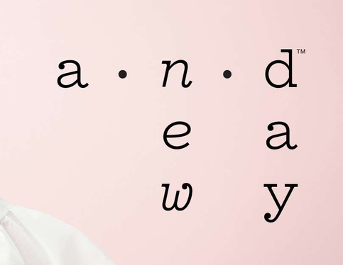
Target’s new logo for their clothing line is so hard to read because they expect the reader to go against the natural way of reading in the western world, which is left to right, horizontally. The new logo is set up vertically (see below).
It has received many customer comments saying it took them a while to figure out it should say a new day. The logo is designed in lower case Pitch font, with some italic letters, to have a quirky, friendly appearance, however, it falls short due to its vertical setup. Even a little bit of logo design testing would have discovered this.
0 Comments
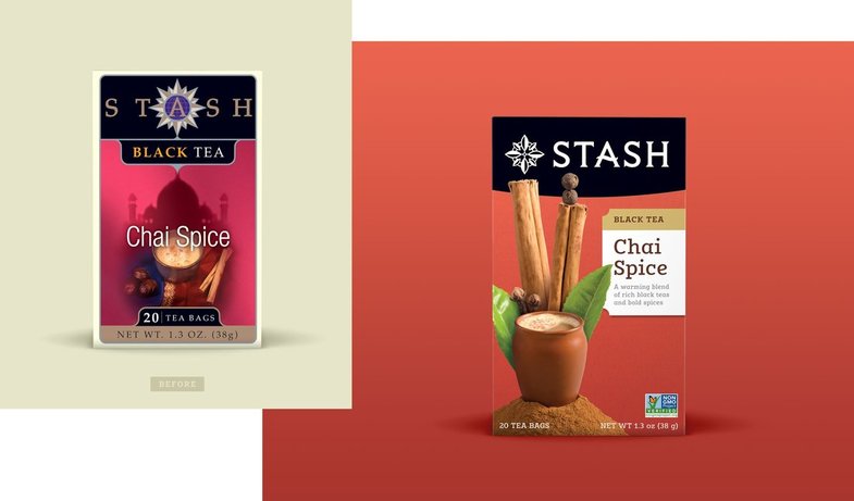
I was out grocery shopping when I noticed Stash teas had redesigned their packaging (by Jolby & Friends in Portland, Oregon). I know it is probably just us graphic designers who geek out on this sort of thing, but showing a before & after helps people see the great impact that fresh design can make. The before is on the left (below). The new design is a photographic style, with a romantic, storybook feel. A much cleaner look since there's no fadeouts as in the previous design. The product name is easier to read since it's white and really pops out, plus there's no compass icon interfering. The flavour of the tea is distinct, along with a lovely description of the tea. On a busy-looking grocery shelf, your product has to stand out and this package design would really entice the target market to buy.
In graphic design, there’s a system for managing colour. We use the Pantone Matching System (PMS), and it it also used by printers, interior designers, and even fashion and product designers. Each colour has a specific number so a printer will know how to add inks to create that “recipe” colour and designers will enter that number in their programs to get that colour. If a project has only one or two colours in its design (such as stationery), then it is more cost effective to print with only one or two inks, instead of the four that make up CMYK printing process. CMYK stands for cyan, magenta, yellow and black. (Think of your inhouse printer with its four ink cartridges.) Process printing uses tiny dots made up of the four CMYK colours to create the illusion of solid colours to the eye. With a Pantone colour, there is also a mix of CMYK colours that will recreate it. However, the CMYK colour will not be as vibrant as a Pantone colour, due to being reproduced just with those four inks (CMYK). Metallic and fluorescent inks can also be printed using a Pantone colour. As a logo designer, I choose Pantone inks from a specific swatch book and it’ll be a close match to a process colour to ensure consistency through all the printed material. When there’s many colours (called full colour) on the page, such as a photograph, the project will be printed as CMYK. For the design pieces that will be on the web, the colour will be changed to RGB (red, green, blue). I create logo design and branding for corporations, including start-ups. I apply the "rules and regulations" that keep the design intact, including logo guidelines for designers and printers to follow.
Did you know there are many different styles of logo design? Wordmark Probably the most common type of logo design for a company, institution, or product name. It uses distinct typography, no icon. Companies such as Visa, Coca-Cola, Mobil and Google have wordmark logos. Pictorial This type uses an icon or image to showcase the business or brand name. These are mainly used for large corporations that can use the symbol on its own with it still being easily recognized. The bullseye of Target and the Macintosh apple in the Apple logo are pictorial logos. Combination Mark (Text and Symbol) Combination marks have the company's name along with a visual icon. The design process requires more time and thought to create an effective image. Lawyers would say a combination mark is easier to trademark than a symbol-only logo since the text is incorporated into the image, so it makes it easier to distinguish from a simple icon. Examples of these are Pizza Hut and Burger King. Emblem An emblem logo is made up of a font inside an icon or symbol such as a crest or badge. Their appearance is more traditional and formal, sometimes meant to represent higher ideas. Many schools, government agencies and auto companies use them. Examples are Starbucks and Ford Motor Co. Logo formats Forget about jpg and png for a high quality logo. Ideally, a logo should be developed as a vector graphic first (often through a program called Illustrator) and then other file types such as jpgs, pngs and tifs can be created from the original vector file. Jpgs and pngs can be used on the web, and tifs are for Indesign or Word. What is a vector graphic, you ask? Vector graphics are created in Illustrator program and consist of shapes. Each piece of the artwork can be specifically chosen and then changed separately. You can change the colour, the size, add more elements, etc. So when a vector graphic is quite large, the file size doesn't get huge. (If you want to make a jpeg larger in size, say to use on a poster, you'll lose image quality and make the file size large and cumbersome. Vector graphics are scalable... meaning when you increase their size, the file quality stays the same.) Basics for your logo design:
|
AuthorSHELLY RACKEL - A graphic designer specializing in all areas of branding. Experienced working with large and small businesses. ArchivesCategories |


 RSS Feed